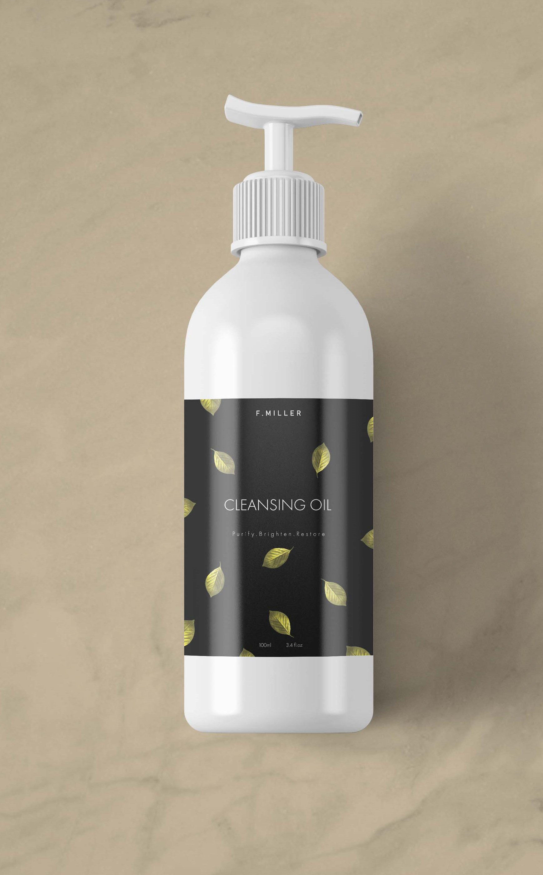
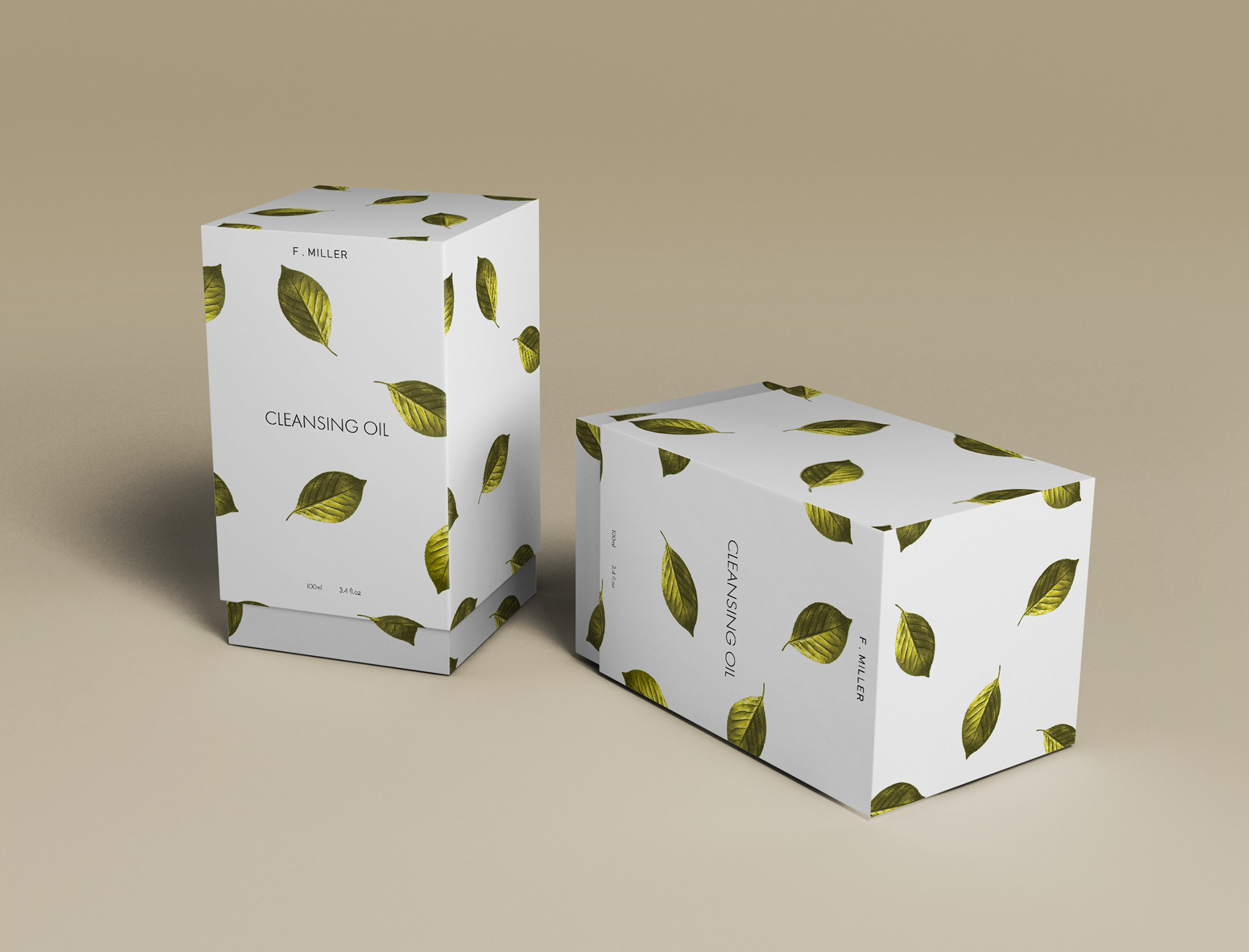
The objective of this project was to redesign a beauty product and its packaging to enhance appeal for a non-binary audience. The challenge involved integrating elements from the F. MILLER brand into the label design. Through thorough research, the solution was to feature gold-toned leaves to symbolize organic ingredients and employ an elegant font for both the title and subtitle, aligning with the brand's sophisticated identity.
