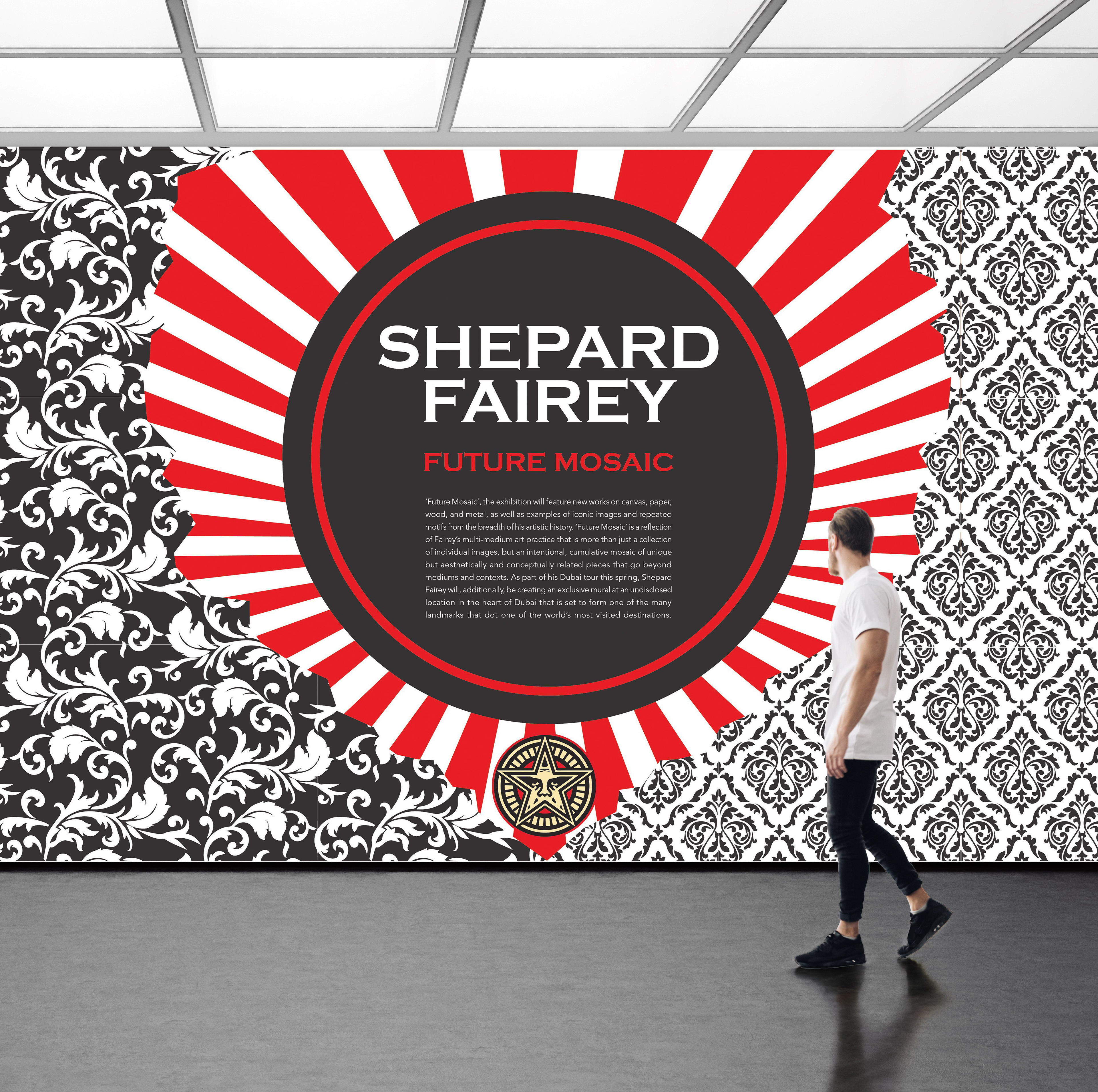
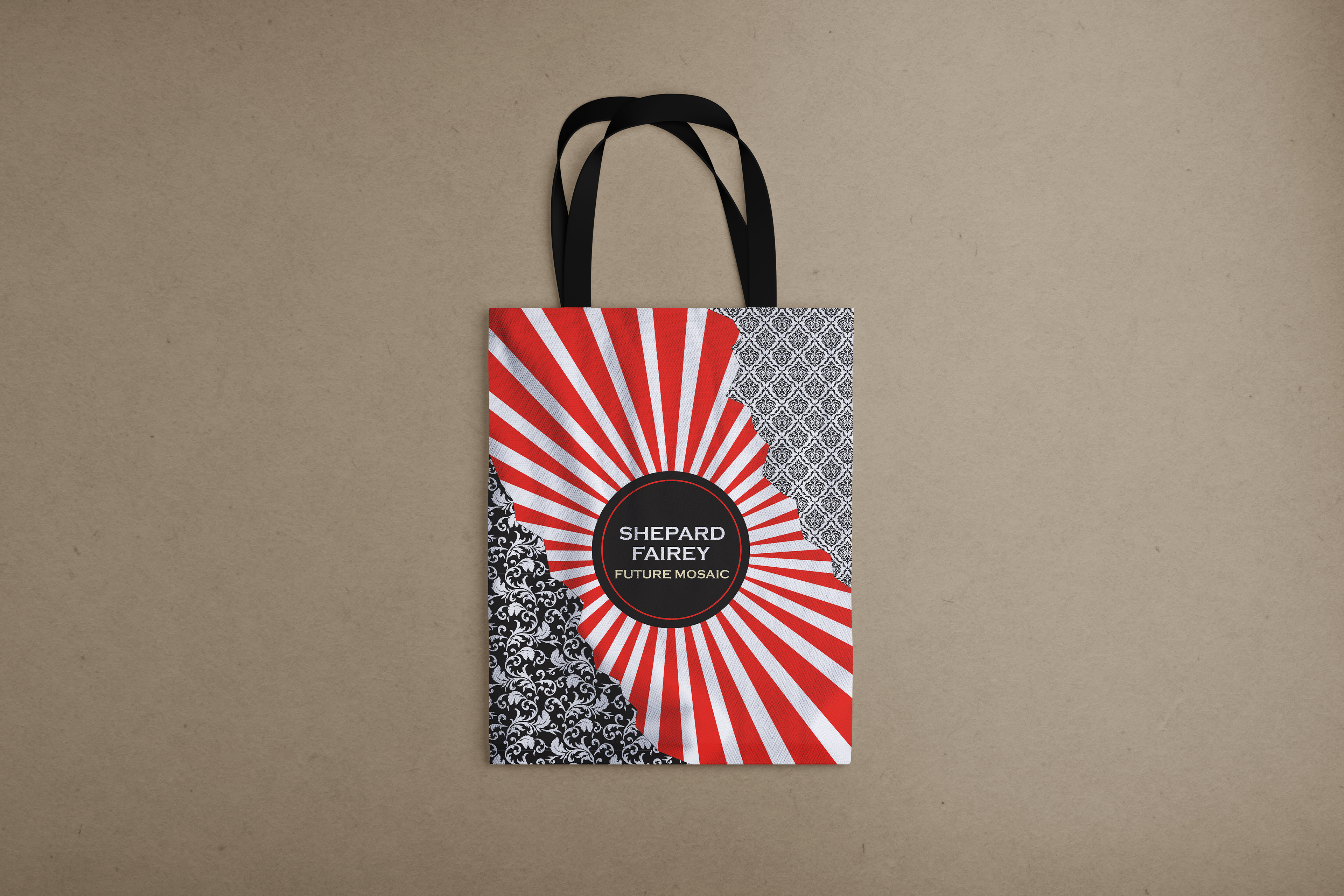
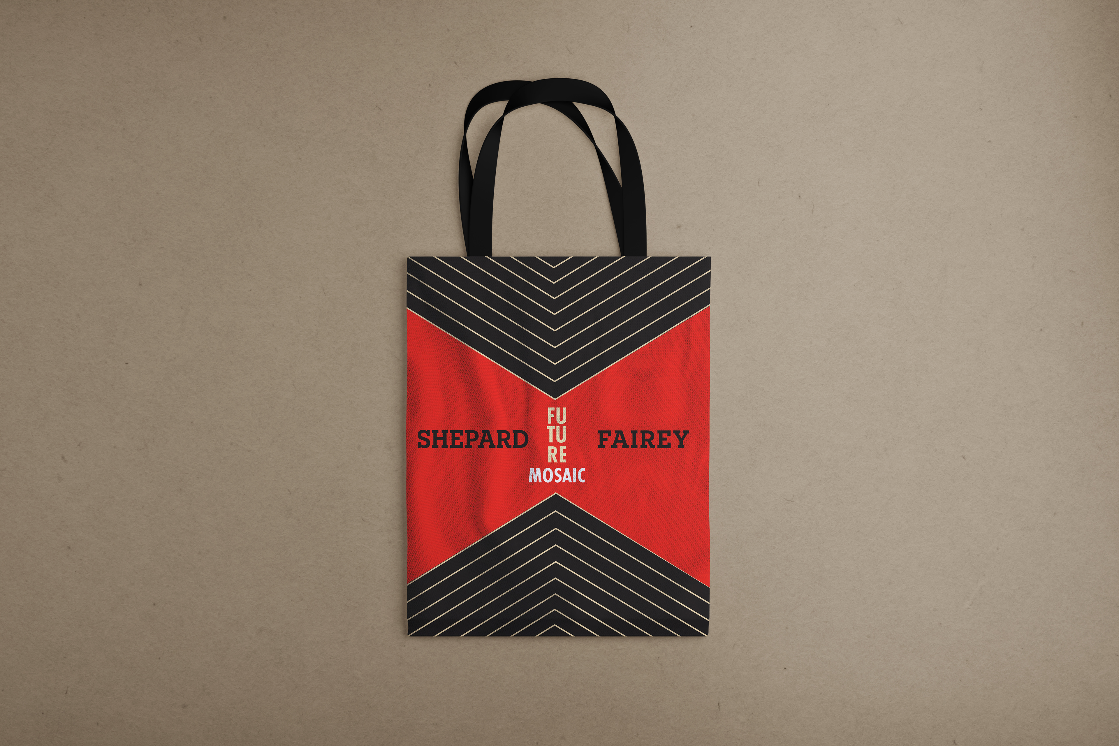
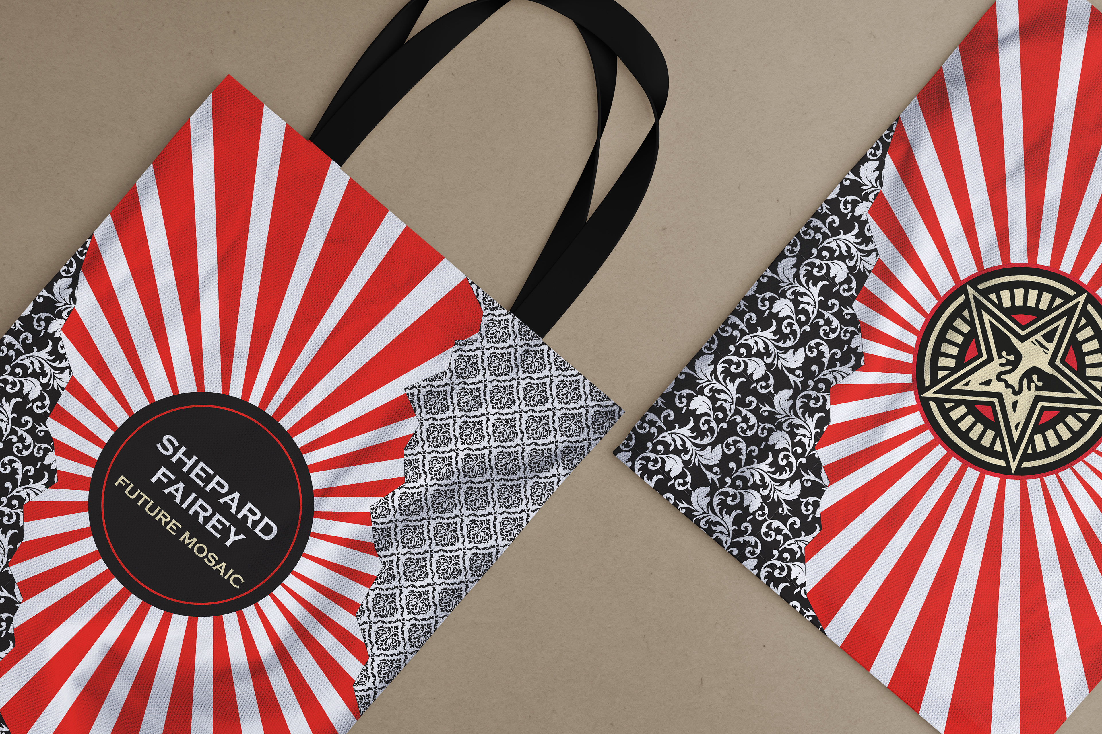
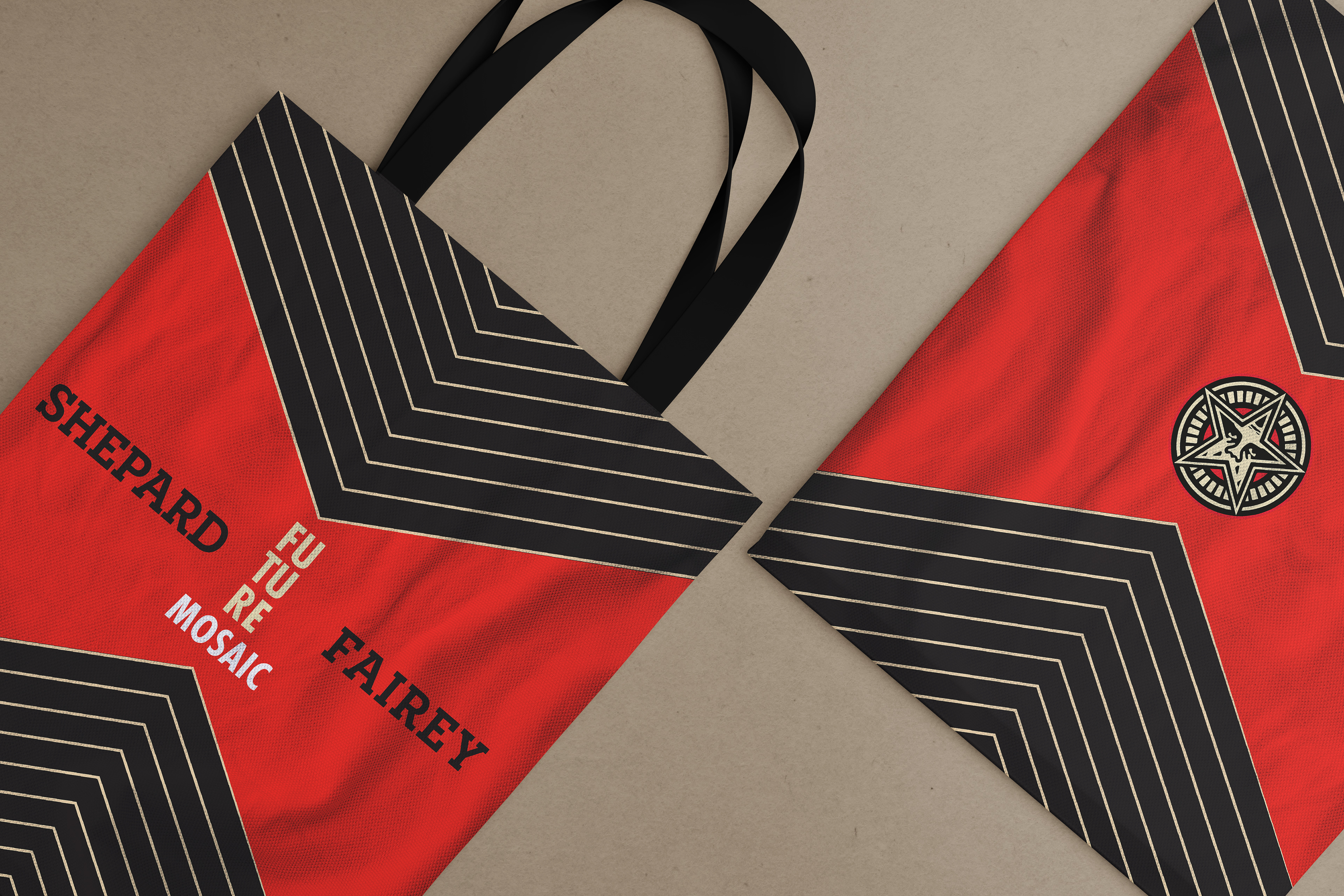
The objective of this project was to design an exhibition wall and tote bag for a prominent artist or specific subject featured in the exhibition. I selected Shepard Fairey due to his striking illustrations, refined patterns, and compelling color palette. My approach aimed to capture his distinctive style without directly utilizing imagery, instead focusing on incorporating similar patterns, torn or damaged edges, and related typography. Presented here are two design concepts that employ different elements while maintaining the signature style of Shepard Fairey.
